Every movie buff out there, or better yet, every single person who’s ever watched a movie, will know that feeling of sensing what’s about to happen before it even happens. And sure, music plays a role too, but have you noticed the color palette changes too?
This brilliant “tool” is called color grading, and if you want your videos to really communicate with your viewers, you need to learn more about the color grade and the use of color palettes, and there’s no better time than now.
What is color grading
No matter if we’re talking about filmmaking, video editing, or even image retouching, color grading is a necessary process for all of those who want to make their work a masterpiece.
This process of “painting over images” is done in the post-production phases of the work of a filmmaker and serves the purpose of emphasizing an emotion, feeling, and overall setting, even suggesting what’s to come by the “simple” use of colors and color scheme manipulation.
In some movies, the scheme will be created for the whole movie, and the producers would stick with it for the whole thing, while in others, a different color palette will be used to emphasize different parts of it – the setting, the emotions, etc.
Thing Game of Thrones. You don’t need to be explicitly told in which of the kingdoms you are, right? You would know it just by the colors!
Well, this is the magic of color grading.
Nowadays, color grading is almost always done digitally, but in the “olden days”, it was a long and exhausting process, also called color timing, and it was done in the film labs.
The term that is often used along with color grading is color correction. These two terms, even though quite close to each other and similar in meaning, actually have two different purposes that complement each other, and the processes go hand in hand in post-production.
The difference between color grading and color correction
Just thinking about the terms “color grading” and “color correction”, you might make the impression that color correction is something closer to “physical labor”, while color grading is something artsy and aesthetic.
Some might even say that color correction is more work, but the fact is – these two can’t go one without another.
The basic color correction process includes adjusting images’ appearance by changing settings such as white balance, ISO noise, contrast, exposure, saturation, etc.
On the other hand, color grading focuses more on things like color matching, cinematic looks, shot matching, communicating and expressing feelings, settings, etc.
In other words, color correction is applied when wanting to cover the camera-made mistakes, or to make the image clearer and more vivid. This method is mostly used for correcting documentary film footage as you need the images to look clean and to be more realistic in a sense, rather than artistic movies with which you can do whatever you like.
Accordingly, color grading is more common in fictional movies, and is more extreme than color correction in a way that its main purpose is to set up the atmosphere, and the colors may vary greatly from the original ones.
But again, color correction and color grading are two methods that give the best results when used together, so looking at one as superior is a definite no-go.
The significance of color grading with examples
Although color correction and color grading aren’t something that’s seemingly in the first lines of making a movie, like directing or acting, they’re SO important that they can affect the overall image, feeling, and emotion of a movie.
So even if color grading doesn’t get the recognition it deserves, it is still so important that it can even be used as a kind of signature for certain directors.
Besides being used as a sign of recognition for master directors, color grading is also a magnificent tool that follows the plot and its changes and progression. And not only in a single or stand-alone movie but in a series as well.
Think Harry Potter, for example – a movie that everyone on the planet is familiar with. The first few movies have warmer colors, but as the characters grow up and as the danger gets closer, the whole movies become more blueish-gray, communicating this grave, bone-chilling danger to a viewer.
In short, color, just like the music, can raise viewers’ senses and prepare them for what is to come. And this is because we subconsciously connect certain colors with certain emotions or that certain colors can trigger them.
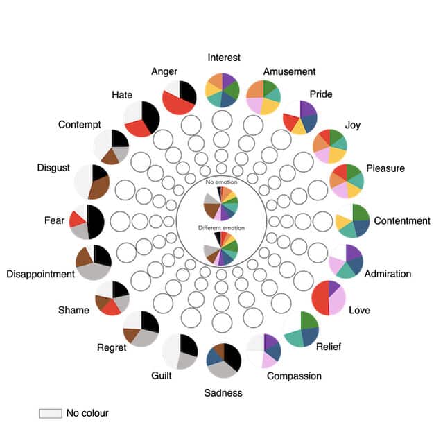
Colors can also communicate the feelings of an on-screen character.
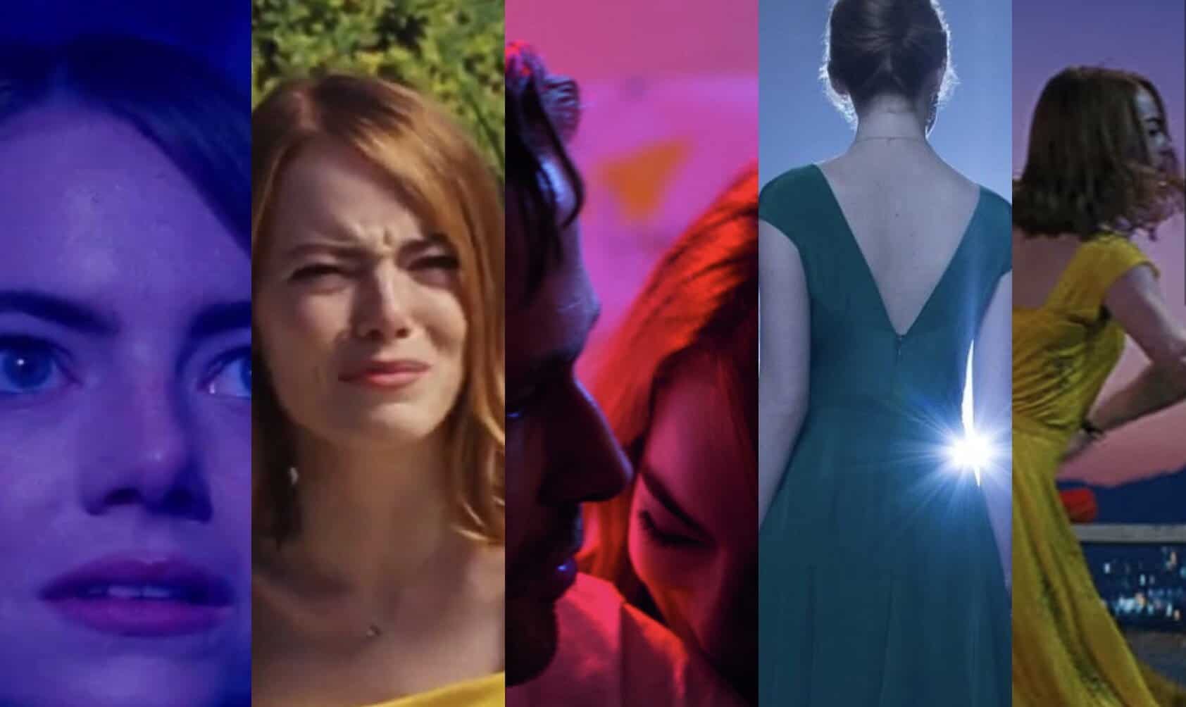
Take La La Land as an example here. Color grading is used as an aid to telling the story, yes, but it is not only following the plot but the character’s inner world and emotions as well. Yellow is optimism, red is being in love, and so on.
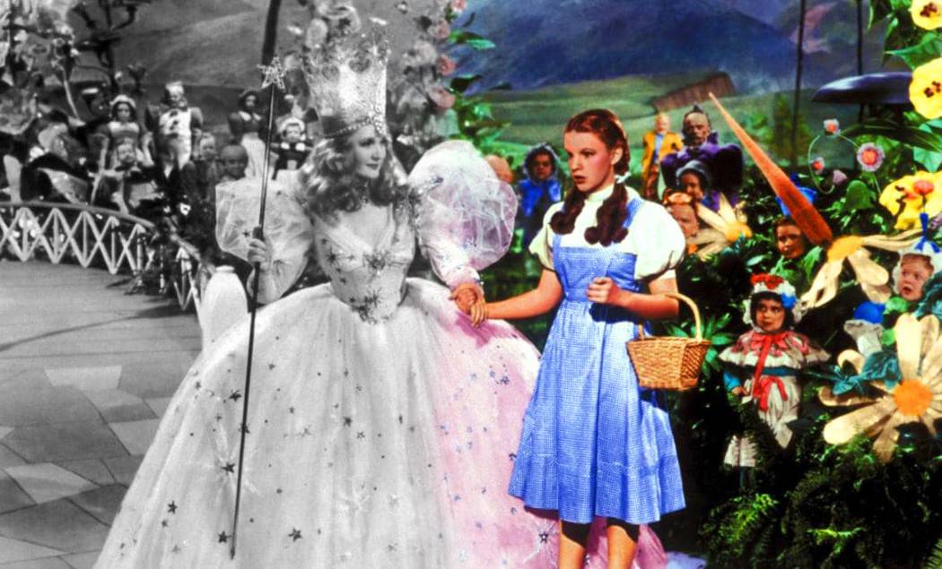
Another example, quite groundbreaking at the time, comes from The Wizard of Oz, where the change in the plot was emphasized with the dramatic effect of transitioning from black and white to color film.
Color grading has been so important throughout the history of film that some of the most iconic movies wouldn’t be as legendary as they are without it.
Apart from the ones already mentioned, here are some more examples:
- The use of Sepia in “The Godfather” makes it seem like the movie is really happening in the 1940s, even though it was released in 1972. Sepia is, even nowadays, generally used when wanting to evoke nostalgia and make something seem like it happened in the past.
- The bleach bypass technique was first used in a movie called “The Rickshaw man” and popularized in “Saving Private Ryan”. Its de-saturated image with high contrast induces feelings of unease and discomfort for the viewers, which is a feeling you want to achieve in war movies.
- Use of contrast in the “Star Wars” epic battle, where the whole image is in dark tones with only two bright spots – the Lightsabers, in blue and red (again, contrasting colors).
Those are just some examples of exceptional color grading use, but there are many more. If you wish to master color grading yourself, there are a few things you should keep in mind.
Tips for better color grading
1. Keep it simple
Keeping it simple doesn’t necessarily mean going for the simplest solution but knowing that less is sometimes more.
Playing around and trying different things while editing can be fun, but overdoing it can lead to unsatisfactory results, an artificial-looking final product, and even seem “overcrowded”.
The best thing to do would be to stick to the pre-determined picture profiles and then add slight changes to them.
Except if your idea was to go overboard all along!
2. The camera is your ally
The better job you do while filming, the less work you’ll have to do when color correcting and color grading.
If you know the general visual tone you want to achieve for your final image, try to get that through lighting, camera positioning, reflections, and so on.
Of course, you can always emphasize what you have, make final color adjustments, and so on, but relying solely on editing won’t get you as far as you might think.
After all, it’s easier to do it right the first time that to have to correct it later on!
3. Adjust the LUTs
If you’re still not comfortable with creating your own color profile, it is perfectly fine to use LUTs – already existing color-grade presets.
Of course, it is not very likely that you will find a perfect match for the tone of your movie, but you can find a similar one and then play with its settings until you adjust it to your needs.
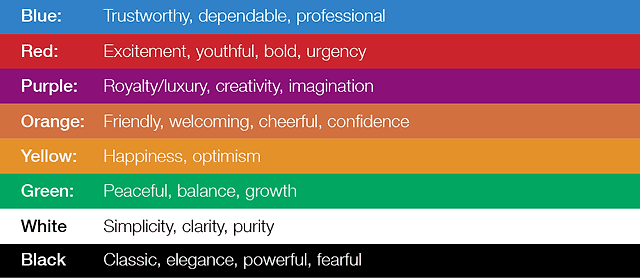
4. Know your color theory
If you are interested in doing your own color correction and color grading, you will need to know at least the basics of color theory.
Color theory is considered both the science and the art of combining colors while explaining how the human eye sees them.
There are three base colors – red, yellow, and blue, and mixing these colors creates all the other colors and shades. All the colors can be found on the color wheel, and based on their positioning on the wheel, they are:
- Analogous (three colors placed side by side on the wheel)
- Complementary (two opposite colors on the wheel)
- Triadic (three equally spaced colors around the wheel)
Next to those three, in the movie color grading, another color scheme is used – monochromatic (use of different shades of one color to accentuate a certain feeling)
Depending on the method of mixing those colors, we differentiate the additive (RGB) and the subtractive (CMYK) color mixing model.
The color wheel consists of primary (red, yellow, blue), secondary (colors that we get when we mix primary colors), and tertiary colors (primary and secondary colors mixed together).
On the right side of the wheel are the colors with the cold temperature, and on the left are the warm colors. Warm colors are used for energetic, vibrant, and action scenes, while cold ones are used for emphasizing calmness and melancholy.
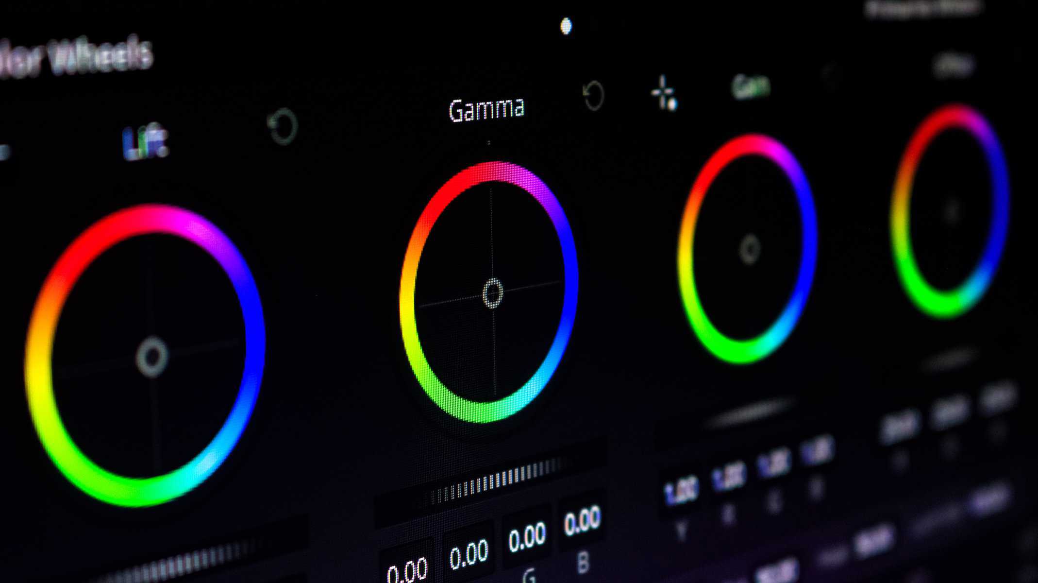
Best color grading software
Now that you know what color grading is and how important it is, it is time for you to try it out and see what kinds of combinations you can make and what emotions you can induce to your viewers.
To get started, you need to get one of the color grading programs.
Some of the best ones, both for professional and amateur use, are:
- DaVinci Resolve 17 and up
- Color Finale
- Adobe Premiere Pro
- Final Cut x
- Adobe After Effects
- Magic Bullet Colorista
FAQ
1. Is color grading important in film?
Color grading is an essential part of the production, as it influences the mood of the entire film and is used to accentuate plot and character development, emotions, and events while depicting the feelings of the protagonists and conveying the message of the movie.
2. What is color balancing in a film called?
When people think of color balance in a film, they usually think of either color correction or color grading process, or both, as both are equally important to change the mixture of colors and correct colors, white balance them or change them dramatically so they would leave the stronger effect on the viewer.